UX Research & UI/UX Design > Data for Social Good
Data for Social Good
UX Research, UX Design, UI Design Lead


Background
Our Client
Data for Social Good (DfSG) provides valuable tools in the form of dashboards to monitor campaign results. The organization offers various platforms that aid in targeting voters, interpreting data, and achieving better campaign outcomes. Our project specifically focuses on two crucial applications offered by DfSG for the canvassing process: the director portal application, accessible through the web, and the canvassing application, designed for mobiles and iPads.
Contribution
Poornima made a significant contribution to the research and design process. She carried out heuristic evaluations to study the client's products, while also conducting user interviews and tests. Her creative contributions encompassed developing sketches, consolidating the low-fidelity screens from everyone into a single entity, designing grid systems, establishing typographic hierarchies, animations, illustrating an iconographic family, and produced a strong style guide for the Data for Social Goods mobile application. Concurrently, she developed presentation templates and took charge of designing the capstone book.
Discover
What is a Canvasser?
The canvassing application offers a user-friendly platform that enables Canvassers to access voter assignments and relevant information, enhancing their productivity and impact. By following tailored scripts aligned with their assigned areas, Canvassers can engage with voters effectively. The application also streamlines the process of reporting and tracking Canvassers progress, allowing easy submission of assignment results and review of past tasks. This functionality empowers Canvassers to monitor and improve their efforts over time, leading to more successful canvassing outcomes.
Problem Statement
Provide the data, tools, and strategies organizations and campaigns need to politicize social networks, build social capital, and deepen U.S. civil society.
Our Client's Needs
During the initial stages of the Capstone, Data for Social Good initiated the launch of their web portal and canvassing application. They sought advice on enhancing the user experience and interaction for their Directors and Canvassers. The main focus was to ensure the effective operation of the web portal and/or canvassing app ahead of the 2024 presidential election.
Our Client's Wants
They aspired for guidance in comprehending the prevailing challenges within the web portal and mobile application, exploring possibilities for enhancing their products, and receiving a proposal outlining novel concepts and designs.
Time
The capstone project started on March 31st, 2023, and came to an end on August 31st, 2023, spanning a duration of 22 weeks for our team.

Literature Review
We focused on four different topics throughout our research. We focused on whether minorities were disproportionately affected by voting laws, voting scalability, the most effective canvassing practices, and what effect the canvassing script has. Our collection of studies aided in understanding the long and hard working process political leaders and volunteers go through to make long lasting impacts in their communities. By conducting a literature review, our team was successful in learning about DfSG's application, the roles Directors and Canvassers play, and eventually aided us in offering our client with solutions to improve the user experience of Directors and Canvassers.
Our Findings
- Lack of scalability in communities leads to a lack of knowledge and significance of voting among younger generations, often resulting in their votes being overlooked
- Voter ID laws in predominantly immigrant-based neighborhoods contribute to residents not voting, as they feel targeted by specific laws in their communities
- Face-to-face canvassing is more effective than digital contact, as people tend to hang up or ignore messages from canvassers
- Canvassers should avoid looking at their phones or tablets while interacting with residents and instead maintain eye contact and engage in organic conversations
- Residents want to feel respected in their communities and appreciate canvassers who make them aware of the voting platform, encourage them to have their voices heard, and emphasize the impact of their contributions to the community
Competitive Analysis
Competitive analysis allow us to develop effective strategies and recommendations for our stakeholders to differentiate and amplify their business and products from others in the market. We compared Data for Social Good with three competitors:

Voter Science: Provide voter outreach and engagement, data science services, campaign and field management consulting

I360: Provide data quality from multiple sources, product suites, support, training, dedicated consultants, and results in real time dashboard for organizations whether in politics or business

Political Data Institute (PDI): Provide data, a mobile canvassing app, canvassing lists, volunteer management, event management, email blast, fundraising, reliable customer service, digital ad partner, printable walk/phone lists, and polling samples
Heuristic Evaluation
We conducted a comprehensive evaluation of the existing applications, focusing on identifying usability violations using Nielsen's standardized usability principles. This evaluation provided us with valuable insights into areas that needed improvement and the underlying reasons. Additionally, it allowed us to familiarize ourselves with the general usability of DfSG's applications. Below, we outline the key principles most frequently violated, which serve as clear indicators of areas that require immediate attention and enhancement:
Canvasser App
- Flexibility & Efficiency of Use: Experienced users lack accommodation for completing tasks faster through shortcuts, hindering their productivity
- Visibility of System Status: The design fails to provide timely feedback to inform users about the status of their actions, leading to confusion
- User Control & Freedom: Similar to the Director Portal, users lack the ability to quickly abandon unintended actions, impacting their overall experience
- Recognition Rather Than Recall: Users experience cognitive burden due to certain components not being clearly visible, forcing them to rely on memory
User Interviews
Our team engaged in extensive interviews with Canvassers to gather insights into their encounters with digital platforms akin to Data for Social Good. We aimed to understand their challenges and requirements regarding the mobile application. As we continued our conversations with users, we identified shared experiences and concerns, enabling us to accumulate a diverse range of feedback. This feedback was subsequently utilized in the process of affinity mapping.
Interviews with Canvassers
We conducted interviews with 6 Canvassers; 30 minutes with each Canvasser.
Here are some of our interview session goals:
- Understand their canvassing experience and day to day responsibilities
- Gain insight into their goals, challenges, and motivations
- Obtain an understanding of their canvassing process, resident's interaction, and the canvassing tools that they use
- Learn about the specific data collection they seek to achieve and success in canvassing
- Validate assumptions and research-based insights

Interviews with Canvassers
Canvassing Process:
Canvassers personalize their conversations with residents similar to an elevator pitch. Canvassers stated they don't want to read a script when going door to door because they lose the resident's attention.
Canvassers always go in groups of at least two for safety reasons. Assignments can also be assigned even and odd for pairs.
Canvassing Planning:
Canvassers view their assignments before starting their canvassing trip in order to plan their route. Canvassers use the app to plan ahead of time.
Canvassing Challenges:
Canvassing is highly reliant on external conditions such as the weather. The weather such as wind and rain, can affect how productive and successful a canvassing trip will be.
Canvassers experience rude interactions with residents. Another challenge Canvassers face are negative experiences with residents. Canvassers mentioned residents can be rude, start arguing, or show signs of aggression.
Maintaining resident's interest or sign up for different events is difficult. As mentioned above, it's very difficult to keep residents engaged, which is why Canvassers have to rehearse scripts and have all the necessary materials ready and at hand.
Canvassing Features:
Canvassers want to see homes on the map systematically color coded. Canvassers visually map out their visits ahead of or during their trip, they would like to see clear indications on the map of the mobile application.
Canvassers use a variety of physical and digital tools besides the canvassing application. This includes physical tools such as paper, notebooks, or flyers. For digital tools, Canvassers as well as directors use Google Docs or Excel for documentation, Slack for communication purposes, and other canvassing tools like Nation Builder and Voxer.
Data Collection:
Collect information on residents who are interested (name, last name, email, phone number, resident's address). CNC collects personal information for future use and for Canvassers to complete their assignments.
Canvassing goals are dependent on how many contacts they collect. Canvassers wants to get to as many houses in a day so the number of contacts they set as goals can change. This ranges from 18 to 70 residents.
Canvassers jot down interactions with residents. After interacting or making attempts to visit the resident, Canvassers usually take physical or mental note of special events or details. This includes if the resident not being home, no longer at the listed address, has refused to speak with Canvassers or other specific comments.
Tools:
Focus design on tablet, seems like it's more used and easier to use too because of the portability and bigger screen size. On the field, due to service or weather conditions, Canvassers use both tablet and personal cell phones to record notes and finish their script assignments.
Technical Challenges:
App loads slow, freezes, connectivity issue, and delays. This is a main frustration for Canvassers when they reach the resident's home and the tablet or application isn't working. Also, Canvassers and Directors have expressed communication between them when the app being slow.
The map does not provide enough information about physical barriers and location details. Sometimes Canvassers run into physical barriers when traveling such as gated communities and houses that the app does not warn them about. Additionally, Canvassers sometimes see apartment complexes misrepresented as multiple houses on the map.
PDI doesn't offer features regarding language barriers. Canvassers often run into residents that speak a language they are unable to understand. PDI doesn't make it easy to see what languages the residents speak, making it hard for Canvassers to prepare themselves when approaching the household.
Canvassing scripts can be hard to read on phones. When a script is too long, Canvassers have trouble reading the script if it's too long. They will sometimes carry a printed script as a backup.
App updates can interrupt Canvassers. One Canvasser mentioned that when they updated canvassing app, they would run into issues such as old features not working, and being unfamiliar to new features.
Canvasser Quotes

“You have their attention for [...] like 20 to 30 seconds, and those 20 to 30 seconds you should be able to get to the point... Because after that you basically lose their attention”
“There is some people that might come off as rude, or sometimes if they see that you’re canvassing for certain politicians or certain campaigns and they don’t agree with, they wanna argue with you”
“The goal for the Canvassers is to get six contacts per hour for a total of 18 contacts for the trip. It’s easy, I think so”
“The tablets are super slow so most of the time we just end up using our own phones.”
“I have to wait until the next address registers so I can know who I'm gonna be speaking with.”
“We’re focused in South Merced because South Mercedes, the area need more, more everything, infrastructure, housing, parks, finish neighborhoods, everything.”
“We try to target the areas we know the majority of like POC are concentrated cause for us that is the priority”
“...once we assign them a new precinct, it'll, it takes a while but it it syncs back to, to them and then we'll get their new precinct on their app”
“I don’t wanna be reading [the script] towards them because it gets boring and it sounds monotone and people don’t like that.”
“It was more hectic and chaotic because we had so much paperwork that sometimes if it was windy, everything would blow off”
“The goal for the Canvassers is to get a six contacts per hour”
“We’ve had people that there’s dogs out there, you know... so there’s just much more to think about when you’re out in the field.”
“There will be this kind of like conflict between us, because they would tell us someone already came by.”
“We have technical issues with the tablet so I'll normally just memorize it on my head.”
Define
User Persona

Education:
Computer Science
Job:
Canvasser, Student
Digital Tools:
Google Suite
Slack
Nation Builder
Voxer
Physical Tools:
Canvassing Kit
Flyers
Tables/Phone
Adrian Rivera
Age: 21 Location:San Jose, CA
Adrian is a computer science student at San Jose University who also works at the school's financial office during the week and dedicates Saturdays to canvassing. Growing up in a Spanish household, he is not only fluent in Spanish but is also deeply connected to his cultural roots. Adrian's ultimate mission is to empower his community, encouraging them to exercise their right to vote, and providing guidance and support to ensure their voices are heard in shaping a brighter future for themselves and their families.
“The canvassing app has performance issues, and the loading time for household information is slow.”
Goals
- Complete more assignments with positive resident interactions
- Distribute more flyers
- Gather more residents contact info. for events and future references
- Motivate individuals to show up and participate in meetings
Needs
- Know the weather for the assigned turf in advance
- Practice scripts ahead of time and personalize the conversation with household members
- Fill out the sign-in sheet in another app
- Work in pairs for security reasons to keep track of each other
- Communicate with Directors and report any issues
- Conduct debriefing sessions with Directors after every canvassing trip
- View their canvassing history and completed assignments
- Record their interactions with residents
Pain Points
- Canvassing app have performance and connectivity issues
- Tablets had more technical problems
- Loading time for household information is slow
- Data entry wouldn’t register in the system
- Use different apps for communication
- Additional notes section in the app is hard to find
- Can’t update household information
- Unable to see physical barriers for houses in the map
- Experience rude direct interactions with residents
Priority Matrix
During our research, we found that Canvassers faced a lot of challenges using the mobile app. Additionally, we saw a bigger opportunity for new features and improvements in the canvassing app to help Canvassers complete their assignments more efficiently.
As we kept diving deeper into the problem at hand, we discovered a handful of features we wanted to change or implement into the product. Obviously, there was only a limited amount of time for the first round of iterations so we had to prioritize what we were looking for. The goals was to develop a hierarchal checklist of changes we would have to make within a limited amount of time to improve the canvassing experience. Luckily for us, we were quickly able to group tasks based off of the value and importance they would bring to Canvassers. This helped our team stay focused and deliver positive results to our clients.

Do First
- Filter assignments by street
- Reset password on canvassing app
- Add extra notes
- Summary of canvassing trip
- Filter odd/even assignments
- Locate nearest bathroom
- Physical barriers for communities

Do Second
- Live weather report
- Call residents
- Tracking information for reimbursement

Do Later
- Track Canvassers’ location
- Plan and save canvassing routes
- Integration of other applications

Don't Do
- View canvassing history
- Record resident interactions
Sitemap
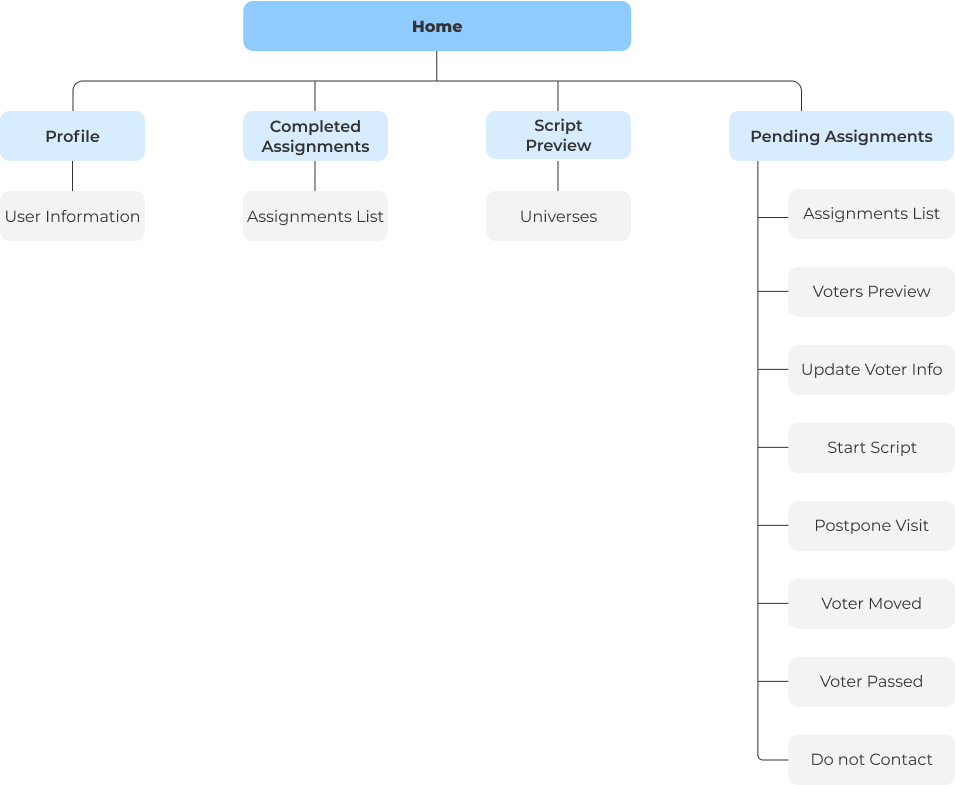
To empathize with user’s experiences, we presented user personas to represent our findings. Our team created a sitemap of the current flow in the mobile application. For the information architecture, we wanted to document the current task and user flow by mapping out the DfSG’s mobile application functions, features and screens. We also used this sitemap for alignment. Mapping out the different screens, functions, and features allowed our team to understand how the user interacts with the app while canvassing. We used this sitemap to help visualize improvements and opportunities for users in the redesign. By performing a heuristic evaluation, navigation was a common theme we found needed improvement. The site’s indexes show us how users navigate through the current app and allow us to improve the user flow.
Ideate & Test
Brainstorming and Sketches
We did a sketching workshop within the group in order to visualize the takeaways we got during the user interviews and research. Our sketches showcased our creativity and thought process of what the canvassing mobile application should look like. We had different versions for the homepage that we all liked and decided to get user’s feedback since it was an important page. The goal on each page was similar, with the layout being focused on encompassing the home page as an easy access page. We were primarily testing for ease of user flow and an intuitive user experience.
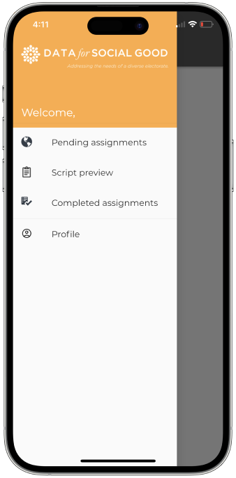
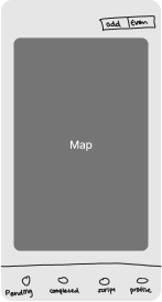
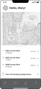
Home Page
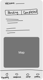
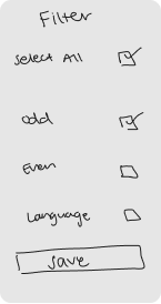
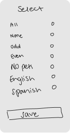
Our next feature was sorting and filtering, such as giving Canvassers the opportunity to organize addresses by odds and evens. We wanted to give users a way to organize and customize their assignments for their liking without having to scroll for long periods of time. We sketched potential filter options and layout that could help them focus on the the tasks they needed to complete. The biggest question was, “Where can we place the filter option so it could be easily accessible?”
Odd/Even Assignments
Low Fidelity Prototyping
Our team used Figma to develop low fidelity mockups for our wireframes. We wanted to test our high-level concepts, visual design and layout including intractability and user experience. Later, our designers will use our lo-fi wireframes for user acceptance testing.
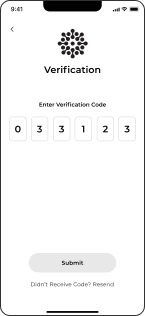
Onboarding
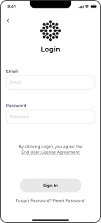
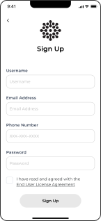
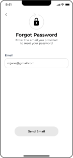
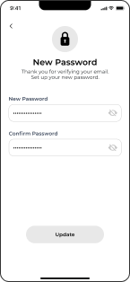
This section includes the login page, setting up a new account, and resetting users password.
Login & Signup
Forgot Password
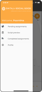
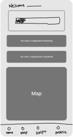
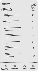
Home Page
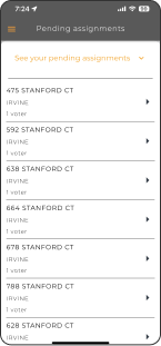
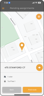
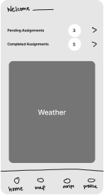
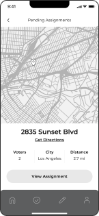
This section includes the Homepage, Pending Assignments, Transition of filters and street names, and the user being guided to a particular residents address.
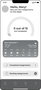
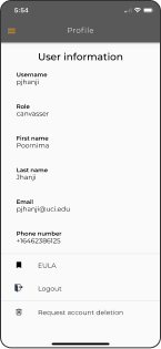
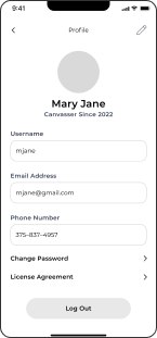
User Profile
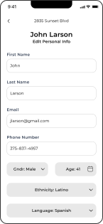
Each Canvasser has a profile page they make to view, edit and update.
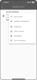
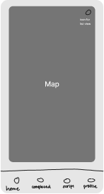
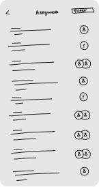
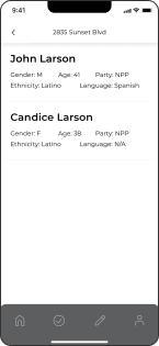
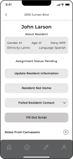
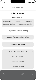
Selecting an Assignment
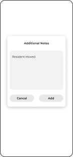
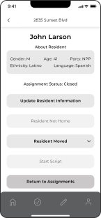
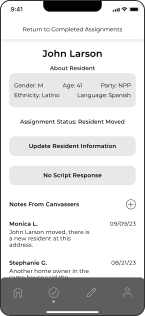
After clicking on a particular assignment, the Canvasser can view the number of residents and go into their about page. They can select a reason for not interacting with a citizen, or tap on “Start Script” to start a conversation.
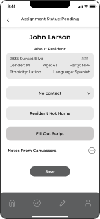
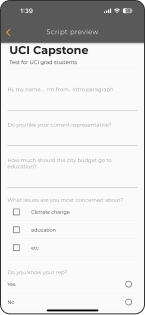
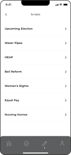
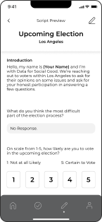
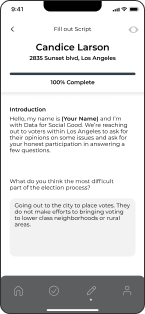
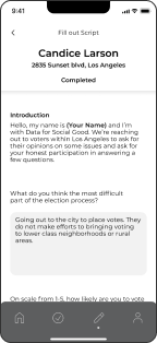
Script
Canvasser can view scripts provided by Directors. After clicking on a script, they can preview the questions and also fill it out.
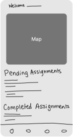
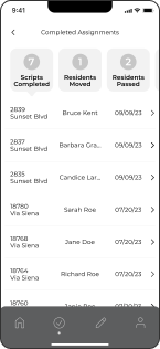
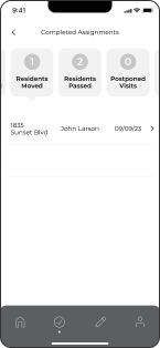
Completed Assignments
Canvassers have access to a history of previous assignments they have completed.
User Testing Tasks
The user testing phase helped confirm the new features we worked on resonated well with users. Additionally, we tested some of the existing functions the app had to find any other issues the users may have had with the app.
We were able to conduct 5 user testing sessions with Canvassers, 3 from an organization affiliated with Data for Social Good (CNC), and 2 recruited online from LinkedIn. Each user interview lasted 1 hour, with the exception of one that was cut short after 15 minutes.

-
A/B Testing with 2 HomepagesGoal: Understand what information users want to see on the homepage, and which homepage resonates more with them
-
Finding the Closest AssignmentGoal: Understand how users interact with the map vs. the assignments list
-
Assignment FilteringGoal: Test the new filtering feature with users, both odd/even street filtering as well as street filtering
-
Completing a ScriptGoal: Understand how users navigate to the script page, as well as getting feedback on individual screens such as the assignment detail page (including our new notes feature) and the script page
-
Goal: Test how users react to our rearranged actions on the assignment detail page
-
Completed AssignmentsGoal: Understand how the user navigates to the completed assignments and see what information they would like to view on the completed assignments
User Testing Analysis and Findings
To analyze the user testing sessions, we used Dovetail, which helped us easily transcribe the interviews, create tags from the transcripts, and group all of our tags. Later, we created an affinity map using the follow steps:
- Coding transcripts
- Group similar quotes
- Generate key insights from groupings
Our main findings included...
- Users wanted a quick and easy way to mark all residents in a house as ‘not home’
- Users wanted brighter colors in the app to help them navigate through it during high sunlight days
- Users wanted the canvassing application to be simple and intuitive
- Users preferred seeing the map and list view of their assignments on the screen at the same time
- Users preferred the homepage with a dashboard view as opposed to the homepage that directly took them to their assignments
- Users wanted to be able to see their filtered results in the map view as well as the list view
- Users were interested in being able to filter their assignments in various categories such as political party
- Users felt as thought having separate buttons for sorting and filtering was redundant
- Users resonated well with the notes feature
- User didn’t find the ‘resident details’ label to be intuitive
- Users were interested to see the overall numbers of how many contacts they had at the end of their day as opposed to specific details of the assignments they completed
Canvasser Quotes
“I think the most important thing about canvassing is just knowing what house you're going to knock on... who's the person you're gonna talk to and like how fast can you pull up the survey or whatever you're trying to ask them. Because in reality a lot of people don't really give you the time of day. You only have about 30 seconds with them, you know, and if you spend 20 seconds navigating through an interface just asking a question, they're gonna be like, okay, I don't really have time.”
“That [street filtering] could be helpful... because when you're out there it's hot and the sun's in your face, you're carrying like your water bottle and all the stuff, the clipboard and the flyers to hand out. Sometimes it's hard to navigate through the app or even to see the screen with the sun in our face.”
Design & Deliver
Font Family
MONTSERRAT
Semibold: Headings
abcdefghijklmnopqrstuvwxyz
ABCDEFGHIJKLMNOPQRSTUVWXYZ
0123456789
Regular: Body
abcdefghijklmnopqrstuvwxyz
ABCDEFGHIJKLMNOPQRSTUVWXYZ
0123456789
Montserrat is a widely used sans-serif typeface in graphic design and typography. It was designed by Argentinian type designer Julieta Ulanovsky and released in 2011. Montserrat's design draws inspiration from the urban typography of the Montserrat neighborhood in Buenos Aires, Argentina, which features a mix of classic and modern architectural styles.
The font is known for its clean and modern appearance, making it suitable for various design projects, such as websites, posters, logos, and printed materials. It is characterized by its geometric shapes, even stroke weights, and open letterforms, contributing to its legibility and versatility.
Montserrat's availability in different weights and styles, ranging from thin to bold, along with its extended character set, has contributed to its popularity among designers. It can be used for both display and body text, and its versatility makes it a popular choice for both print and digital design applications.
Grid System
Checkbox

Radio

Navigation Bar

Color Palette
Logo
Mobile App
Map Pins
Iconography

Buttons

High Fidelity Prototyping
Based off of our user testing using our low-fidelity prototype, we were able to develop high-fidelity mockups by using Figma. After reviewing the findings, our team was able to create a few iterations and build off of our low-fi wireframes. We wanted to test our high-level concepts, visual design and layout including intractability and user experience.
