UX Research & UI/UX Design > IKEA
IKEA
UX Research
Introduction
Our team opted to employ a heuristic evaluation and competitive analysis to scrutinize and explore the IKEA website. IKEA specializes in affordable, ready-to-assemble furniture and appliances, and their website serves as a platform for customers to explore and purchase products while providing a wealth of inspiration for functional spaces.
The primary goal of this evaluation was to gauge the website's usability, particularly in the context of product searching. Additionally, we aimed to understand how IKEA's competitors have structured their websites and the advantages and drawbacks of those platforms. This project outlines the findings, pinpoints key usability issues, and offers recommendations to enhance the shopping experience for IKEA's clientele.

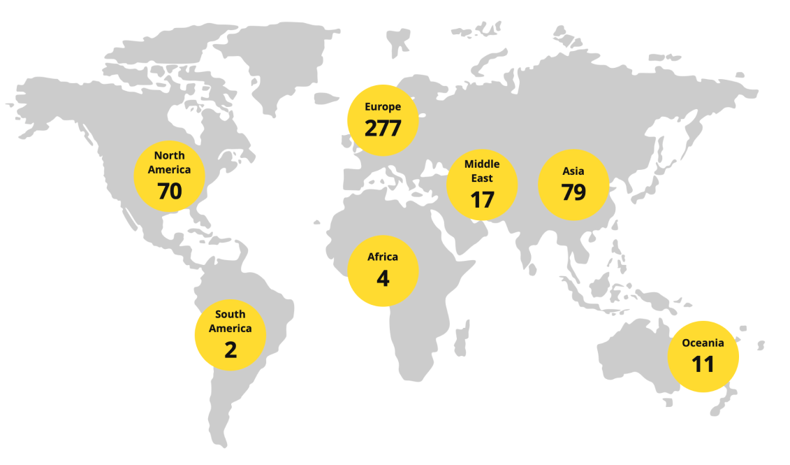
There are 460 IKEA stores in 62 markets globally
Ikea is a global leading brand for affordable home goods
Heuristic Evaluation
In order to discover potential design and usability flaws in the Ikea website, our team used Jakob Neilson’s 10 Usability Heuristics as guiding principles.
Tasks to evaluate positive and negative findings
- Find a black living room chair that is under $300
- Add the chair to the shopping bag
- Delete an item from your Ikea shopping bag
Key Findings: Discovered 6 negative issues.
- No error message if typo in search text
- A typo in the search results to irrelevant products
- Hard to tell which filters are applied in the search results
- Editing the selection in product comparison unselects previously selected products
- Users are unable to quickly view the items in their shopping bag from any page without having to navigate to the dedicated "shopping bag" page
- Sidebar displays incomplete information when a product is added to the “shopping bag”

Competitive Analysis
In order to provide users with relevant product results, smoother navigation, and a personalized experience, our team conducted research on both direct and indirect competitors.
Key Findings
- Wayfair has a clear navigation menu which expands and displays other items when clicked on
- Amazon provides suggested products based on users search history
- Amazon displays better results despite misspelled searches
- Lego provides better product assembly instructions
- Amazon shows a quick view of the cart as a side bar on every page
Recommendations
- Provide personalized product recommendations based on users’s search history
- Provide auto correct feature for misspelled words
- Display a side bar with more information when a product is added to the shopping bag
- Improve item deletion and quantity change in the shopping bag
- Reduce time for checkout process
Card Sort Findings
Card sorting is a research technique used in UX design to help understand how users categorize and prioritize information.

Card Sort
Product Recommendation
Product Recommendation
Asked participants to group product types (e.g., armchairs) with other product types users consider similar into designated product categories.
Card Sort #1 Results
Many users believe that certain products do not fit well in specific categories

Card Sort
Menu Recommendation
Menu Recommendation
Asked users to categorize items from the menu into predetermined groups. They were also given the opportunity to add their own category.
Card Sort #2 Results
Participants ranked “Products” as the most important in the hamburger menu with “Account” coming in second place.

Qualitative User Testings
Conducted live user testing sessions with UserTesting.com
Asked users who are familiar with IKEA to find a living room chair on their website and scale the task on a level of difficulty and success rate
- Users had difficulty finding “chairs” in the hamburger menu
- Search result shows irrelevant products as well
- Filters used in search results were not displaying accurate results.
- Selected filters are not apparent at first glance, creating confusion and frustration for users.
- Unlike other sites such as Amazon and Target, Ikea does not have a “Recommendations Page” which could enhance the personal experience between consumer and company website by showing products which the user may be interested in.
Based off of these findings, we developed a redesign of Ikea’s website and ran quantitative tests to exam the improvements we’ve made.

Quantitative Usability Testing
Used Maze.com to conduct surveys to determine the usability of the new IKEA prototype
 |
Users spent approximately less time in searching and adding a black living room chair to their shopping bag and removing it |
 |
97.0% of the participants reported feeling more confident that an item had been successfully added to their bag as a result of the redesign. |
 |
The green mark helped give users visual confirmation that their products were added to their shopping bag |
 |
Participants liked the side bar preview of their shopping bag appear on the right side of the screen |
 |
The data shows that 97.1% of the participants reported feeling more confident with the color filters visible in the search results. |
Redesign
Next Steps
Key Learnings
Through the research of heuristic evaluations, competitive analysis, card sorting, qualitative and quantitative testing, we have discovered that Ikea can improve their website in the areas of search results, search filters, add to bag confirmation, and personalized recommendations.
Pending Issues
The categories under hamburger menu need further classifications and sorting based on users frequent interactions.
Future Actions
After redesigning the hamburger menu, we can run additional quantitative tests to ensure users are able to find products more easily.

Scroll to the top