Graphic Design > iHip Package Designs
SIMPLE
PROJECT TYPE
Branding, Packaging
ROLE
Graphic Designer
TOOLS USED
Illustrator, Photoshop
YEAR
2019-20
ABOUT
"Simple" was one of the first projects I worked on as a graphic designer in 2019. While working at Zeikos, it became a learning ground for studying, developing, and implementing eye-catching package designs. The project's name was "BASIK," and the idea was to build a single universal dieline that could harvest any goods inside to produce a clean and appealing presentation on shelves in diverse locations.
BASIK: ORIGINAL CONCEPT
The project began with a dieline for a plastic package with different color palettes that would help identify product compatibility; blue for USB cables, green for micro, and red for type-c. After adding the finishing touches to the design, a tangible test print came back so that we could interact with and get to know the advantages and disadvantages.
The package was a small, lightweight, bendable, and great concept for airport customers. One of the disadvantages of the bundle itself was that ink did not settle well on plastic, making it unreadable. Another factor to consider was the package itself was somewhat transparent, and the product inside was seeable through the visual on the front, which did not give a clean look.
SIMPLE: NEW SLATE
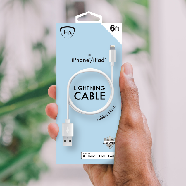
By considering everything, the best idea was to start over again but keep the vibrant color palette. The new dieline would have a height and width that would not change, but different depths depending on how thick the products were.
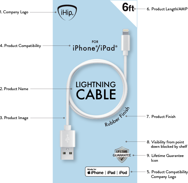
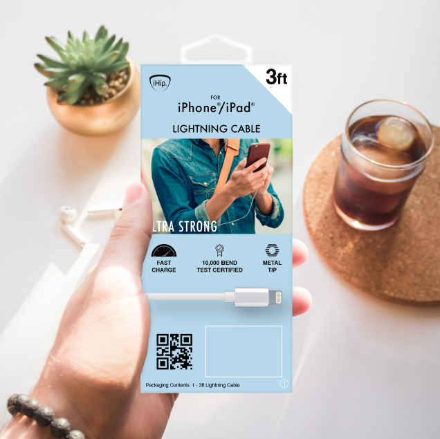
Front Essentials
When designing the front of the package, it was necessary to conduct a list of components that were crucial to execute on the front of the case.
- Company Logo
- Product Name
- Product Image
- Product Compatibility
- Product Compatibility Company Logo
- Product Length or AMP
- Product Finish Material
- Visibility of everything on the package on shelf (1.5inches from bottom would be blocked my shelf)
- Lifetime Guarantee icon
With all 9 things taken into consideration, the final front template looked like this
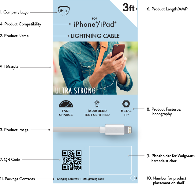
Back Essentials
Like on the front of the box, the back needed a basic layout so there'd be uniformity in concept.
- Company Logo
- Product Name
- Product Image
- Product Compatibility
- Lifestyle
- Product Length or AMP
- QR Code
- Product features: Iconography
- Placeholder for Walgreen barcode sticker
- Number for product placement on shelf
- Package Contents
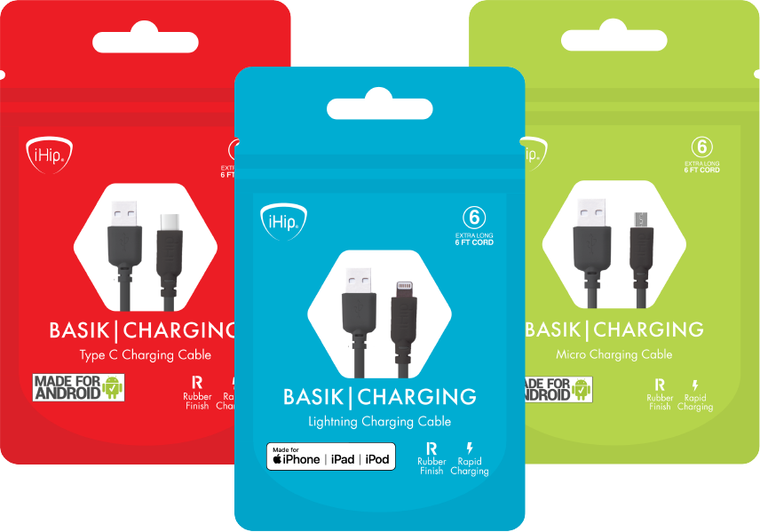
COLOR PALETTE
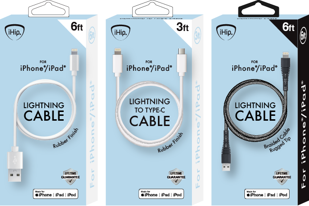
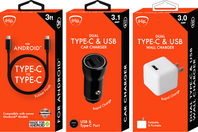
Once the template had become a solid foundation, it was easier to implement the other products into the same template. The next step was to apply the vibrant color palette onto the packages that would correlate with the product compatibility.
Blue: Lightening Cables
White: Accessories
Green: Micro Cables
Red: Type-C Cables
Pantone:
290C
HEX: #b9d9eb
RGB: 185, 217, 235
CMYK: 21, 8, 0, 8%
Pantone:
381 C
HEX: #cedc00
RGB: 206, 220, 255
CMYK: 6, 0, 100, 14%
Pantone:
172C
HEX: #fa4616
RGB: 250, 70, 22
CMYK: 0, 72, 91, 2%
Pantone:
White C
HEX: #FFFFFF
RGB: 255, 255, 255
CMYK: 0, 0, 0, 0%
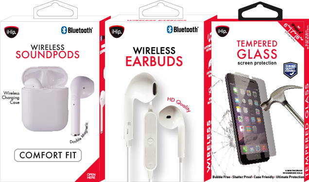
FINAL PRODUCTS
APPLE PRODUCTS
APPLE & ANDROID PRODUCTS
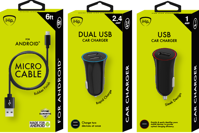
ANDROID PRODUCTS
OTHER ACCESSORIES
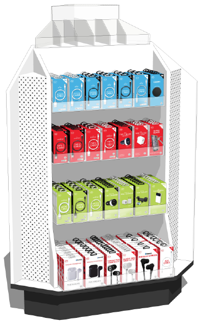
PDQ SHELF PLACEMENT
Thinking of display, the best way to present the designs was by placing the products together by color.
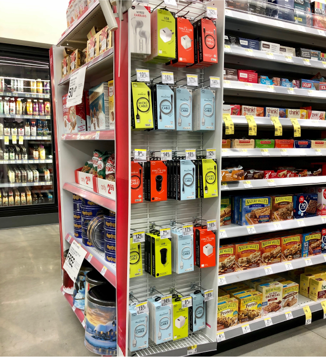
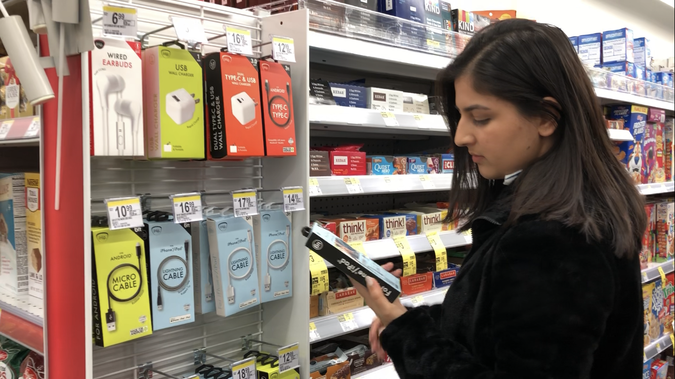
COLLECTION IN STORES

Scroll to the top